Have you ever tried centering a div or a paragraph in CSS and ended up with unpredictable results? Despite how straightforward it sounds, centering elements in CSS is one of the most misunderstood aspects of front-end development. Why is it so hard to simply “center” something on a web page?
The answer lies in CSS’s complexity. The right technique often depends on the type of element you’re trying to centre, whether it’s inline, block, flex, or grid, and how it’s intended to behave across different screen sizes.
With a wide range of methods available, from simple text-align rules to powerful layout systems like Flexbox and Grid, understanding when and how to use each one is essential for creating effective and responsive designs.
This comprehensive guide breaks down the most reliable and modern methods for centering elements in CSS, explaining the use cases, benefits, and potential pitfalls of each.
Why Is Centering in CSS a Core Skill for Developers?

In web development, centering content helps maintain symmetry and improves visual hierarchy. It’s fundamental in creating balanced user interfaces, be it a login form, a call-to-action button, or an image slider.
However, challenges arise because CSS doesn’t offer a universal centering solution. The context in which an element exists, whether it’s inline, block-level, floated, absolutely positioned, or part of a flex or grid container, changes the strategy required for proper alignment.
Therefore, mastering multiple centering techniques ensures developers can create visually appealing layouts that behave consistently across devices and browsers.
How Can Text Be Centered Using CSS?
Text elements, such as headings, paragraphs, and inline links, can be centered easily using the text-align property. This method works for inline and inline-block elements placed inside a block-level container.
Example: Centering Text Inside a Container
CopyEdit
<div class="text-container">
  <p>This text is centered.</p>
</div>

<style>
.text-container {
  width: 400px;
  border: 1px solid #ccc;
  text-align: center;
}
</style>
This method does not affect block-level elements like <div> or <section> unless they contain inline content.
How Can Block Elements Be Horizontally Centered?
When centering block elements such as <div> or <form>, the most common approach is to apply margin: auto and define a fixed or percentage-based width.
Example: Using margin: auto
CopyEdit
.center-div {
  width: 50%;
  margin: 0 auto;
}
This divides the leftover horizontal space equally between the left and right margins, placing the element in the centre. However, this method will not work if the width is set to 100% or is not specified at all.
What Is the Role of Flexbox in Centering Elements?
Flexbox is one of the most powerful and widely supported layout systems in CSS. It allows for both horizontal and vertical centering with minimal code, and it adapts well to dynamic content.
Horizontal Centering with Flexbox
CopyEdit
.container {
  display: flex;
  justify-content: center;
}
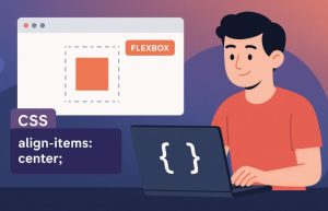
Vertical Centering with Flexbox
CopyEdit
.container {
  display: flex;
  align-items: center;
  height: 200px;
}
Centering in Both Directions
CopyEdit
.container {
  display: flex;
  justify-content: center;
  align-items: center;
  height: 200px;
}
Flexbox is ideal for centering in one-dimensional layouts and is responsive by design, making it suitable for modern web interfaces.
How Does CSS Grid Simplify Centering?
CSS Grid, unlike Flexbox, is meant for two-dimensional layouts, but it also makes centering straightforward. Using place-items: center or a combination of justify-items and align-items, you can centre content both horizontally and vertically with just a single line of code.
Example: Centering with Grid
CopyEdit
.grid-container {
  display: grid;
  place-items: center;
  height: 200px;
}
Grid is particularly effective when dealing with full-page layouts or complex structures requiring control over both columns and rows.
How Can Positioning Be Used to Centre Elements?

Absolute positioning is a classic method to centre elements when their height or width is known. This approach involves setting the parent to position: relative and the child to position: absolute, with top and left set to 50%. Since this only moves the top-left corner to the centre, further adjustment is necessary.
Using Negative Margins
CopyEdit
.child {
  position: absolute;
  top: 50%;
  left: 50%;
  margin-left: -50px;
  margin-top: -50px;
}
Using transform: translate
CopyEdit
.child {
  position: absolute;
  top: 50%;
  left: 50%;
  transform: translate(-50%, -50%);
}
The transform method is more flexible and responsive because it doesn’t require predefined dimensions.
What Are the Simple Methods for Vertical Centering Without Flexbox or Grid?
In cases where Flexbox or Grid isn’t an option, like supporting very old browsers, developers can use padding or line-height.
Padding Technique
CopyEdit
.centered-content {
  padding: 70px 0;
  text-align: center;
}
Line-Height Technique (for Single Lines)
CopyEdit
.centered-content {
  height: 200px;
  line-height: 200px;
  text-align: center;
}
These methods work best when the content height is fixed and predictable.
How Can Images Be Centered Horizontally in CSS?

Images are typically inline elements, so you must make them block-level first using display: block, then apply auto margins.
Example: Centering an Image
CopyEdit
img {
  display: block;
  margin-left: auto;
  margin-right: auto;
  width: 50%;
}
This ensures the image centres within its container, and the width can be adjusted to suit the design.
How Can Float and Absolute Positioning Be Used for Alignment?
Although not ideal for centering, float and position: absolute are useful for left or right alignment.
Example Using Float
CopyEdit
.right {
  float: right;
  width: 300px;
}
Example Using Absolute Position
CopyEdit
.right {
  position: absolute;
  right: 0;
}
If using floats, it’s necessary to clear the float afterwards to prevent layout collapse. This is typically done with a clearfix.
CopyEdit
.clearfix::after {
  content: "";
  clear: both;
  display: table;
}
Which Centering Method Works Best Across Devices?

Responsive design demands that centering techniques adjust seamlessly to screen sizes. This is where Flexbox and Grid truly shine. Both methods support media queries and allow flexible resizing, so the layout remains intact across desktops, tablets, and mobiles.
Responsive Flexbox Example
CopyEdit
@media (max-width: 600px) {
  .container {
    flex-direction: column;
    justify-content: center;
  }
}
How Do Various Centering Techniques Compare?
The table below summarises the most common centering techniques in CSS and their ideal use cases.
| Technique | Direction | Responsive | Use Case | Notes |
| text-align: center | Horizontal (inline) | Yes | Paragraphs, inline text | Simple, not for block elements |
| margin: auto | Horizontal (block) | Yes | Divs, forms | Requires fixed width |
| Flexbox | Both | Yes | Layouts, UI containers | Modern and preferred |
| CSS Grid | Both | Yes | Page layouts | Best for 2D structures |
| position + transform | Both | Yes | Popups, overlays | Great for unknown sizes |
| Padding or line-height | Vertical | Partial | Static-height text blocks | Not ideal for complex layouts |
What Common Mistakes Should Be Avoided While Centering in CSS?
Many developers fall into traps when trying to centre elements, leading to broken layouts or inconsistent behaviour.
One frequent mistake is using margin: auto without setting the element’s width, which results in no effect. Others misuse Flexbox properties or apply outdated methods without fallbacks, breaking the layout on modern devices.
To avoid issues:
- Define widths where needed.
- Prefer Flexbox or Grid for complex layouts.
- Test across browsers and devices.
- Avoid using floats for centering.
Conclusion: What’s the Most Effective Way to Centre Elements in CSS Today?
There’s no one-size-fits-all solution, but knowing the right tool for the task is key. For simple horizontal text alignment, text-align: center works well.
For layout containers and flexible designs, Flexbox is the preferred method. For more complex structures, CSS Grid provides ultimate control.
Older methods like position: absolute with transform are still useful, especially for tooltips and modals. Line-height and padding offer quick solutions for vertically centring text in controlled environments.
Mastering these techniques ensures that your layouts remain robust, responsive, and user-friendly, regardless of the platform or screen size.
Frequently Asked Questions
How do I center a block element horizontally without using Flexbox?
Use margin: auto and set a defined width for the block element.
Is Flexbox better than absolute positioning for centering?
Yes. Flexbox is more flexible and responsive, and requires less manual adjustment.
Can I use Grid to centre a single element?
Absolutely. CSS Grid’s place-items: center is ideal for centring one or multiple elements.
Why doesn’t margin auto work on my div?
It likely lacks a defined width, or it’s not a block-level element.
What’s the difference between align-items and justify-content in Flexbox?
Align-items controls vertical alignment, while justify-content controls horizontal alignment.
How do I make sure my centred content is responsive?
Use relative units like percentages, and adopt Flexbox or Grid for layout.
Can I combine Flexbox and Grid for centring?
Yes, but it’s best to use one layout system per container to avoid conflicts.